Monday, 2 November 2015

OUGD501 Study Task 04 - Establishing Requirements Of Your Practical Investigation


To prove through the practical the discussion that is the man focus of the essay, to assess whether structuralism or poststructuralism pay an appropriate place in graphic design as an industry.

The hypothesis that I am assuming will evolve from the essay and therefore will be tested through the practical is that post-structuralism will play a more appropriate place in graphic design.

The primary research will take place in the practical section, through the means of a survey/test that will use the practical developments to test the conclusion of the essay, the secondary research will pertain to the books and journals researched in the essay part of the module. The aspects learnt from the written research will help inspire the practical side.

The synthesis between the practical and written sides of the module will come out of the fact that the essay will conclude with one of two different conclusions, whether structuralism and poststructuralism pay a more appropriate place in graphic design. The design side of the module will link the practical and written in a way that it will aim to test the conclusion drawn from the essay.

The developments within the practical aspects will be used to create a range of tests in which I will use as part of a survey/testing situation in which participants will be asked to choose between two different outcomes, one pertaining to structuralism and one pertaining to post structuralism.

As the essay part of the module is the biggest level of work within the project that will take up the majority of my time, two weeks will be allocated possibly for the designing stage and then a further week will be used to test the practical outcomes and gain a further developed conclusion from the essay and the practical.

Monday, 19 October 2015

OUGD501 Studio Task 03 - Establishing A Research Question


In todays COP2 session we were briefed on the third study task of which we would have to take part in that would help us with the initial development of out COP2 module. This task was to get us thinking about the question of which we would take forward in to the essay stage to write about and furthermore how we link the practical side of the project.

I believe this will be very beneficial to me as it may help me to combat the problems that I found last year with this module in the way that even though I enjoyed the topic of my essay last year I picked a subject area of which I couldn't find a lot of research about and I believe this held me back as it limited the scope of my essay. Although as I did pick something I am really interested in the practical side to the project worked very well. This year I am aiming to pick a subject area that allows me to find enough research on the topic but also that I really take an interest in so that I will enjoy creating the practical work.

The first stage of the study task was to read a handout that was provided relating to the idea of topic and concept generation and then ayer having read the help sheet start to think about the question that I will take in to the essay part of the module by answering the questions in the box's below…


OUGD501 - Study Task 03 - Establishing A Research Question?

Suggested Research Question.
This can be a topic or theme, but please try to be as precise as possible.
Structuralism & Post-structuralism and more specifically what place they as theoretical philosophical movements play in graphic design, inspired by their links to design such as authorship and evaluated through visual aspects such as semiotics. 


Which Of The Module Resources Does This Question Relate To?
You can find these on eStudio - Try to list at least three.
Philosophy

Industry 

Authorship


Which Academic Sources Are Available On The Topic?
Include a Harvard Referenced bibliography of at least 5 sources.

Chandler, D. (2001). Semiotics:the basics. London: Routledge.

Eco, U. (1984). Semiotics and the Philosophy of Language. Bloomington: Indiana University Press.

Hawkes, T. (2003). Structuralism & semiotics. 2nd ed. New York: Routledge.

Ward, G. (2003). Postmodernism. Chicago: Contemporary Books.


Sarup, M. (1993). An introductory guide to post-structuralism and postmodernism. 2nd ed. Harlow: Harvester Wheatsheaf.


How Could The Research Question Be Investigated Through Practice?
What Graphic Design would you make in response to this, and why?

The research question would be tested through the practice, through the means that it will test the conclusion of the essay even further, by providing a means to test whether the beliefs behind structuralism or poststructuralism are appropriate to graphic design.


Peer Feedback – How could this topic be refined / developed?
Show this form to a fellow student. They should record their feedback in the box below

Try and be more specific to what areas and topics will be assessed in the essay part of the module.

Think further how the practice aspects can test the conclusion of the essay section.

Find a way to link the essay with graphic design more specifically.


OUGD501 Studio Task 02 - Parody & Pastiche


We started the second seminar of the COP module by being given two different pieces of text one written by Frederick Jameson and the other written by Linda Hutcheon. Both of the pieces of text are written around the concept of the comparison of parody and pastiche with both of the authors standing with different beliefs around the subject. This seminar will provide a very important part of my analytical research skills as it will improve my understanding of the comparison of two different pieces of texts that are based on the same topic but stand with different beliefs on the topic and therefore allowing me to piece together a deep understanding of  a subject. In the seminar we then read through the texts and outlined the parts of the texts that were related to our topic of parody and pastiche.


 In her book The Politics of Postmodernism:Parody and History Hutcheon(1989) she states that "What I mean by 'parody' here is not the ridiculing imitation of the standard theories and definitions that are rooted in eighteenth century theories of wit. The collective weight of parodic practice suggests a redefinition of parody as repetition with critical distance that allows ironic singling of difference at the very heart of similarity." In which she describes parody as the act of not just mimicking a certain era of which is being brought to intention in a ridiculing and derogatory way, but rather it consists of bringing said era's to light to elude to its faults and ironically point out its drawbacks, rather than ridiculing the era, attention is brought to the standpoints and ironic tendencies. 

Contrastingly to the last definition In his book Postmodernism Jameson(1991) he states that "Pastiche is, like parody, the imitation of a peculiar or unique, idiosyncratic style, the wearing of a linguistic mask, speech in a dead language. But it is a neutral practice of such mimicry, without any of parody's ulterior motives, amputated of the satiric impulse, devoid of laughter and of any conviction that alongside alongside the abnormal tongue you have momentarily borrowed, some healthy linguistic normality still exits"in which he eludes to the fact that rather than eluding to a previous era with the end goal of outlining its faults and set backs instead pastiche relates to the practice of mimicking something that came before it, non in a ridiculing sense but actually to draw attention to the era and its attributes in a positive way.


OUGD501 Studio Task 01 - Authorship & Graphic Design

For the first study task of this new COP2 module we were asked to take everything we had learnt from reading and discussing Roland Barthes' essay "The Death Of An Author" in the earlier COP seminar and then using the knowledge we have gained from the essay to write a small 500 word evaluation based around writing a short analysis of the work of one graphic designer, or one aspect of Graphic Design Practice that relates to the central themes from the Roland Barthes essay. In the analysis we would have to include a minimum of three quotes from the Barthes text and then a further quote from one of the additionally provided texts.


In my analysis I will discuss how points raised by Barthes do actually link to the the modern day graphic design practice referring to how it still appropriate to say that the meaning work is all surrounded by how it is perceived by the viewer, never one fixed meaning delivered by the author, but actually dependant on the viewer themselves. This relates further to the modern graphic design practice in the way that depending on the viewer in a piece of graphic design use of aspects like colour, type and layout could be perceived differently.
In Roland Barthes' essay he puts forward a debate in which he challenges the idea of authorship and its links to authority itself. In the texts he delves in to the theory that can be linked to other areas of life whether it be the circumstances he is discussing in the books or to many other areas of society and culture such as music and art, that contrary to popular belief that the author is the most crucial part of any piece of work and that theoretically it should be seen through their eyes to understand the work, actually he shifts the importance over to the viewer saying that the meaning is different depending on the viewer itself. This has been proved many times in the history "recent research has demonstrated the constitutively ambiguous nature of greek tragedy, its texts being woven from words with double meanings that each character understands unilaterally" Barthes, R (1977, p148). He wants us to reject the thought that the meaning of anything is solid and fixed and accept the fact that the meaning of work can be ever changing, dependant on the eye of the reader "In precisely this way literature, by refusing to assign a 'secret' , an ultimate meaning, to the text, liberates what may be called an anti-theological activity, an activity that is truly revolutionary since to refuse to fix meaning is, in the end, to refuse god and his hypostases - reason, science, law" Barthes, R (1977, p147)

In the second paragraph Roland says "The author is a modern figure, a product of our society insofar as, emerging from the Middle Ages with English empiricism, French rationalism and the personal faith of the Reformation" Barthes, R (1977, p142). In this quote Roland is referring to the fact that although the author is an individual with their own belief at the point of creation, he says that all they are really are is an encompassment of everything that has happened in the past. He is implying that the person no matter how individualistic they might think their beliefs are have all stemmed in some way from the past before their life and the experiences in their own life. Therefore there can be no one individual correct belief but actually a different meaning depending on many different aspects such as the viewers social, cultural and political background. These points were further developed on in an Eye Magazine article related to the topic in which they say "The so-called 'death of the author', proposed most succinctly by Roland Barthes in a 1968 essay of that name, is closely linked to the birth of critical theory, especially theory based in reader response and interpretation rather than intentionality." Rock,M.(1996). This further reinforcing the validity of his more philosophical way to think and the fact that it actually fights against the norm of hierarchal understanding and actually put the subordinates in control of which Is a much more developed understanding of how we comprehend everything relying on our own solo experiences as human beings and not people who read and recite information unconsciously.

Bibliography  

Barthes,R.(1977) Image-Music-Text, London, Harper Collins

Rock, M. (1996). Eye Magazine | Feature | The designer as author. [online] Eyemagazine.com. Available at: http://www.eyemagazine.com/feature/article/the-designer-as-author [Accessed 19 Oct. 2015].


OUGD501 Studio Brief 01 - Briefing


Today we were briefed on the context of practice module for Level 5. As this was the module of which dragged down the averages of my overall grade for level 4 I will have to reflect on my last years attempt and then use the negatives from what I discover to overall improve my module last year. I am looking forward to this as It gives me an opportunity to improve massively on an aspect of which is the worst area of my graphic design practice.

I will be concentrating more in the development of this module when it comes to the research and understanding stage as this lack of understanding and research is what pulled my whole grade down.

Monday, 4 May 2015

OUGD401 COP Module Evaluation

Overall I had found this COP module very hard. This was due to the fact that I am massively  inexperienced with writing essays and so then when it came to the essay writing stage I panicked and everything went wrong initially but this I later found out to a lack of preparation on my end. This meant that when I gave it another go after properly planning and preparing for the essay that actually I found the essay much simpler to write and eventually actually found it much much easier.
This had proved to me that planning is the basis of everything and that is what I would need to improve on with my next essay although the module has got me back into the thought process of writing essay and hopefully I will learn from this module and take on the positive attributes into the next context of practice module.

In contrast I found the practical side of the module very very entertaining as I had a strong basis to build on from the essay and with a few minor decision I was ready for creating my practical work and this went without any major glitches.
I think that I have really enjoyed the practical side as due to the nature of writing an essay on the related subject it really suited the way I like to work with a very big sense of a contextual background to the work making it easy to do, designing with a purpose is much easier than designing for the sake of it.

Overall even though I found parts of the module quite hard I have really enjoyed it due to the fact that it had really got me back in the swings of an area of my education the writing and theoretical side that I have been out of touch with and it has prepared me for any similar module I will face in the future.

OUGD401 COP Practical Project Poster Testing and Question Rationale

Now that I have finished my poster design It is now time to do some testing by form of a crit to see that if I have effectively managed to answer the question that I had originally set out to answer that was could I effectively use not only the aesthetics of the anti-vietnam war posters but also through my contemporary anti war designs have I managed to capture the sense of expressionism and non-conformity found in the anti-vietnam posters I have been looking at.

In doing this I didn't want to influence anyone answers through the wording of the questions so I decided I would put forward to questions in the simplest way that I could;

"Do you think that through my contemporary anti-war posters I have captured well enough the aesthetic and contextual aspects that made the design work linked to the anti-viatnam campaign so successful? and if so or if not so WHY?


The overall response that I got was overwhelming in the way that the vast vast majority of feedback that I got about them was brilliant in the way that everyone thought that I had effectively achieved what I had set out to do.
To summarise the feedback into the overall prominent beliefs I was told that I had effectively achieved what I had set out to do due to the fact that firstly the posters displayed perfectly the prominent sense of an importance of imagery in the posters that was used massively through the anti-vietnam war posters to the viewers mind thinking.
Secondly it was said that the colour choice was brilliant as even thought it doesn't really link to what was used at the time it makes a perfect link between the vintage and the contemporary through contextual side.
Penultimately it was said that due to the fact that I had designed my own font giving me freedom in the designing stage and furthermore that the lack of use of a grid structure when designing the work had coupled together and meant that my work perfectly displayed  both the expressionistic and non-conformist nature I was looking for.
Finally with the addition of thought-provoking informational content and this coupled with the last three things the vast overall impression was that I had through my posters very well displayed the attributes that made the historic anti-war posters so successful.

To rationale the whole process through the designing and testing of my posters I believe that I have achieved what I initially set out to do that was to take inspiration from the very successful anti-war Vietnam posters and then to transfer this inspiration through aspects of the older designs into my contemporary anti-war posters to make them successful in a similar way.

OUGD401 COP Practical Project Poster Development

Now that I had decided what the content of my posters was going to be it was now time to set about with the creation of the posters. I have already outlined the aspects that I want to display through the posters EXPRESSIONISM, REBELLION and MORALITY.

The initial stage was to decided in which way I would display the content. Because of the fact that I wanted to add a high sense of imagery through the posters that can be seen in the vintage design work. To add this sense of imagery to provoke moral thoughts I decided to use a range of three images of which are related to the war of which I believe will be effective in provoking the thoughts of the viewer and here they are below, I wont be using the images directly but as I am doing a purely typographic piece I will be using the images as an outline for the placement of my text.


Due to the nature of the fact that to be in-fitting with the style of the Vietnam anti-war posters meaning I had no sort of grid or structure of layout to follow and this coupled with the fact that the pre-existing work follows no rules with the layout and size of type meant that with a small amount of editing and no restrictions on myself I was very easily able to fit the type into the shape I was going for meaning that It made me able to achieve my purely typographical pieces but still adding a sense of imagery. 
This almost randomised type placement and sizing further re-enforces the nature of non-conformaity and rebellion that I took inspiration from in the Vietnam anti-war posters.

The final step in the creation of my posters was to chose the colour scheme, to be in keeping with the style of expressionistic artwork I was looking for and to add the sense of excitement I was looking for I decided to chose three relatively bright colours and to further link the colour scheme to the contextual side of the project I decided that I would use the three colours of the american flag, and to finish it off have the background in black as I believe that coloured text would stand out best against the black. This colourful aspect both links the contextual side of the project but also is in-fitting with the inspiration that I took when I found that the colours and "inyourfaceness" were crucial to the success of the posters I took inspiration from.


OUGD401 COP Practical Project Poster Content and Statistic Research

Now that i have decided that aesthetic that I want my posters to be designed in it is now time to decided on the content of the posters I am going to design. As I have decided to do a set of three posters I have decided that each one will feature information about a different contemporary war. They will all link together firstly by using the same aesthetics and secondly also all feature the tag line "END THE WAR IN _____" of which will be changed appropriately for each contemporary war location. Along side this tag line there will be an inclusion of two different facts about each war. For the three wars I have decided to feature Iraq, Syria and Afghanistan and here are the facts I will include below;

Syria

"More than 140,000 Fatalities"

"11 Million Refugees Evacuated"

Iraq

"210,000 Dead Civilians and Combatants"

"Estimated $2.2 Billion Dollars Spent By The USA Total"

Afghanistan

"2211 US Lives Lost Since October 2001"

"$700,000,000,000 Spent By The US Total"


OUGD401 COP Practical Project Font Development

Having looked at a number of pre-existing anti Vietnam war posters it had became apparent to me that the most crucial part to the whole practical side of my unit If I was wishing to complete my initial set out plan and recreate the positive attributes of the older posters in my contemporary war posters that I would need a very expressive, cursive but also non-conformist feel from my type that was massively exaggerated in the anti Vietnam posters.
After having thought about it for a while I had come to the conclusion that there wasn't a font that I could use through the computer that would come anyway near to displaying the feelings that I intended and that I would be the best idea for me to create one for myself. I decided this would be the best way as it will allow me to create the font to my liking without restrictions, allow me to create a font that fully displays the feelings and meanings I was looking for and finally the rough hand rendered aesthetic would fit in perfectly with the style I was going for.

I started out by drawing out a full alphabet of my typeface with added extras such as some glyphs and numbers. When I was happy with the finished hand drawn product I then scanned in the typeface and through the use of live tracing on illustrator and then a few minor tweaks using the anchors points the finalised font was now a digitalised vector and was ready for em to use in my posters.


OUGD401 COP Practical Project Poster Research

Due to the fact that at the time of the Vietnam war the posters weren't about the artist themselves but actually about fighting the cause for my research I won't be looking at an artist that inspires me but actually will just be looking at multiple examples of pre-existing anti-vietnam war posters to gain inspiration from and here they are below;


From looking at these posters I gained massive inspiration as from them and thinking about the posters in relation to my essay I had outlined what I believe were the main overwhelming points that made the posters so successful and they all are encompassed by three outlining factors.

The first part of the posters of which I believe was a reason why they were so successful is the fact that they all encompass an overall colourful, exciting and expressionistic style of which was massively in their favour as it makes the work very eye-catching and this is the reason why so many youths of the time were so attracted to the movement and the expressionistic design of the movement attracted them.

The second reason as to why I believe they are so successful comes down to the fact that they all massively work around to process of using imagery in the posters to provoke moral thoughts from the viewer. In such a troubling time such as during a war the use of this morality provoking appealed to the youth of the time making the following grow and grow.

The final aspects of the posters that I would like to also portray through my contemporary anti-war designs is the overwhelming sense of non-structure, non-conformity and rebellion that is apparent in the work through the lack of structure and grid work in the work and the use of ever-changing text with no two letters the same proportion. In a time of war the youth of the age wanted to stand up against what was happening and change it and this non-conformist sense to the work was one that very much attracted the youths who shared the belief.

To summarise to accurately impersonate the aspects of the Vietnam anti-war posters of which made them so successful in my contemporary anti-war posters I would have to display my found three aspects... MORALITY, EXPRESSIONISM and REBELLION. This will be the basis to what I create my whole practical project around.


OUGD401 COP Practical Project Initial Thoughts

It was now time to start with the creation of my practical side to the COP module. To summarise what I will do through the practical side of the project I will be looking at examples of anti-war campaign graphic design for wars during the time of the hippie counter-culture from wars such as Vietnam and through looking at this graphic design I will take aspects of It that I believe made it so influential in the expanding of the following that related to the youthful audience namely the expressionist and colourful side to the work that attracted the many through aesthetics but furthermore also through the non conformist and rebellious side that the work also had which attracted the audience not through aesthetics but through morals and ethos'. Reflection on the aspects that I will take from the pre-existing hippie counter-cultural graphic design I will then take these forward and use the same aspects in the creation of my own contemporary anti war graphic design while still managing to achieve my goal and give the same sense of expressionism, non-conformity, engagingness, rebelliousness, colourfulness and most importantly impact full feelings that the older hippie counter-cultural graphic artwork gave off.

OUGD401 Context Of Practice Study Task 6

For this task we had to go to the library and pick out two dissertations from the previous years and to read these not for the purpose of the content of the essay but instead to see the style in which the essay was written, taking in to context Punctuation, Grammar, Tone Of Voice, Referencing, Vocabulary, Writing Style and Structure and this is what I did.

For the three points I first thought back to my feedback from the initial draft of my essay and look at three things of which I needed help with in order to complete my essay. The three aspect of which needed drastic change were Referencing and how to do it, The structure of my essay, and in which tense and style they write in.

Firstly I chose to look at the referencing as this was a major problem to my essay. I was really unexperienced with how to reference and where to reference, even though we had tutorials on this It didn't really sink in so when it came to the draft I had really struggled and not been able to reference it correctly so having looked at the way the essay is correctly reference and with a little extra work myself I will be able to properly reference my final essay.
Secondly I chose to look at structure of the essay as one of the biggest pieces of feedback I got back from the first draft was that my essay was structured all wrong and due to this lack of structuring through proper paragraphs and etc that my essay became unreadable even though the content was perfect and so therefore I looked at how the dissertation was structure and in which way they would make points and progress with them meaning after doing this when writing my final essay I would be able to structure it correctly.
Finally I decided to look and the style in which they wrote the essay. A big problem that I had was that due to my lack of experience writing university level academic essays I wrote the whole essay in a personal tense of which is wrong for an academic writing it all has to be based on facts not opinions, after looking at the dissertation it made me realise in which was I would have to write.

OUGD401 Context Of Practice Study Task 5

Practice Based Research

This task was set to begin our thought process of how we will take the research on points from the essay we had wrote and then to convert this into thoughts about the practical side of the project, and the research we would conduct from the essay points that could inform our practical work.

The first part of the study task was to take the practical issues/aspects from our essay and then to evaluate these issues on three different basis' the first being Technique, the second being Content and the third being Communication. For the content of my essay I chose to write about how graphic design played a crucial part in the expansion of the 1960's hippie counterculture and further discussing the individual aspects of the graphic design of the movement from the artists doing the graphic design to the individual elements of the mainstream lifestyle that the movement lent itself too such as the magazines and music of the time.


Technique


The graphic design of which was supporting the up and coming counter-culture feature the use of a lot of colour in order to add an element of attraction through interest. It also feature a very postern-modern approach seemingly following no rules or guidelines designed free and in what ever way the artist wanted. Further more there was a large focus on individuality and almost a sense of no need of perfection making the artwork engaging to its audience.


Content


The content of the graphic design was a combination of both typography but also image to accompany it. The content has a large sense of the fact that it was all hand rendered and drawn. Originality and engagement was apparent through the use of extreme typographic and attractive and eye-catching colours and illustrations respectively.


Communication


The whole main ethos and feeling that cam through the supporting graphic design of the time communicates and overall massive sense of expressionism, excitement and non conformity with the designer using whatever style they wanted to give a sense of youthfulness and revolution that the message of the graphic design gave. The whole belief from the counter-culture that the rules and normal guidelines didn't have to be followed and actually them having the freedom through the graphic design to do whatever they want. REBELLION


The next task to complete was to write a comment on three different aspect of the practical-based research. These three aspects are Research/Analysis, Exploration/Evaluation and Testing.


Research/Analysis


For my practical based research I will look at examples of graphic design from the era of which were crucial to the artwork and more specifically the pieces of graphic design of which were created for the purpose of anti war campaigns and this look into the style in which will help me work out what aspect of the graphic design style I could take into my practical.


Exploration/Evaluation


I will take on the inspiration from the aspects of the anti war campaign graphic design and take these into my design work so that mine benefit in the same way that the graphic design of the time did. Using this older style but instead in my work maintaining the expression and non-conformist stye.


Testing


To test my work I will ask for the opinions of my peers that through my practical work have I managed to display both the colourful and exciting style of the movement while also maintaining the expressionist and nonconformist sense to the work meaning that I have perfectly taken on the research and exploration into the research for my practical work.


The final task for this whole exercise was to now write a proposal for my my practical research by answering the following questions;


1.What is your research question?

Can the positive aspects of the graphic design of the time be used in a contemporary context and still be as effective as it was during the Hippie counter-culture?
2.Do you have a hypothesis (an assumed conclusion that you will endeavour to prove)?

By reflecting on the positive aspects of the graphic design linked to the hippie counter-culture I will able to prove that I can through my work that similarly to the design of the hippie counterculture I can reflect on the expressionist, non-conformist and attractive style used to gain the attraction of the youth movements.
3.What are the contexts of your research interests?

To prove that through the use of these techniques in my contemporary anti war design and evoke the same feelings and aspects found in the graphic design of the hippie counter-culture.
4.Sources of primary/secondary research.

Images and examples of work from the hippie counter-culture that features the show the aspects of the work that I am looking to take inspiration from. Then I will use crits to see if I had managed to incorporate the chosen aspects of the hippie counter-culture graphic design.
5.How will your practical work relate to your written work (synthesis)?

In my written work I discussed the aspects of the graphic design of the movement of which massively helped the expansion of the movement and in my practical work I will reflect on the aspects and recreate them in my contemporary anti-war practical work to achieve the same results as the actual graphic deign of the era.
6.What methods will you use to research, develop, create and test your work?

To sum up the whole process I will gain research by looking at pre-existing examples of hippie counterculture graphic design to see aspects of the design of which I believe helped the graphic design support the movement. I will develop the aspects that I look at into crucial elements that my work would definitely have to include to correctly represent the same ethos' displayed in the pre-existing work. I will then create my practical work with these aspects in mind and then finally test my practical work by gaining feedback from peers for if my contemporary anti-war designs incorporating the aspects from the hippie counter-culture design had perfectly displayed the feelings that came from the older anti war designs.


OUGD401 Context Of Practice Study Task 4

Essay Structure

Introduction

Explanation the question and in which topic I will be answering it

Background into society, opinions, youth and movement


How I will answer the Question


First Point


Time in history that the movement started


Second Point


Modernist artform a dying race, new trends needed?


Third Point


Psychedelic Drugs


Fourth Point


Nature of the youth audience


Fifth Point


Its entry into the music industry

Sixth Point


The Album artwork


Seventh Point


Compatable magazies showing similar views joining onto the movement questioning society?


Famous People?


Eighth Point


Connection between the graphic design and the rock music of the time


Conclusion 


Conclude on my points

Do I think I have effectively answered the question?


OUGD401 Context Of Practice Study Task 3

Hypothesis

In my essay I will try to asses the question "Discuss the role that Graphic Design has played in Political and/or social change in a specific period in history". I will do this discussing the effects that the related graphic design had to the massive expansion of the 1960's Hippie Movement from the select few that started it to the masses and masses of followers that ended up following the movement. I will be backing my last point by discussing what aspects of the graphic design were specifically important to the movement and how these reasons massively lent itself to the expansion of the counter-culture.

Reading and Referencing


Graphic Design: Reproduction and Representation Since 1800


"In the summer of 1967 the Ohserver Magazine announced the demise
of the mod movement (’Ready, steady, gone’) and primed its readers
with the key signifiers of a new, surfacing style, that of the ‘flower
children’ or hippies." A distinct and new aesthetic was emaging
in Britain and in the USA which linked disparate phenomena such
as the kaleidoscopic effects developed by the graphic designers
Martin Sharp and Hapshash and th e Coloured Coat; the multi-
layered and electronic forms of experimental rock music pioneered
by The Beatles and bands like The Soft Machine; and the vividly
pattemed, colourful and eclectic fashions of dress then on sale at
boutiques like Granny Takes a Trip on the King's Road in London."

This piece of information from the book could help me in my essay as It would help me to discuss how the fact that the previous youth trend has recently seen its demise meaning the now confused youth were more willing and looking for a new trend to follow, paying a big part of the reason to why the Hippie Movement was so quickly escalating.


 Jobling, P., & Crowley, D. (1996). Graphic design: Reproduction and representation since 1800. Manchester: Manchester University Press :.  


OUGD401 Context Of Practice Study Task 2

For the study task we were given some information to follow and then when finished we were asked to out i ton out blog;
Post ONE example of a work of Modernist Graphic Design and ONE example of a work of Postmodernist Graphic Design to your blogs, accompanied by a short written explanation of why you think each work is Modernist / Postmodernist.
Include reference to the designer and the date of the works production.


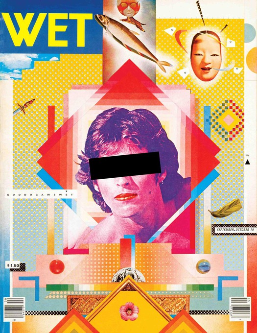
These two pictures are my examples of modernist and post-modernist graphic design. The first image of which is the modernist example is called Beat the Whites with the Red Wedge (1919) by El Lissitzky and the second of which is a classic example of post-mordernism is the front cover of Wet Magazine designed by April Greiman and Jayme Odgers, 1979.